September 2, 2026 . . . Written by Milla Miller
Choosing colors is easy, but making them work together is the hard part. What makes a good color palette? Color theory sounds a bit complicated. But trust me, it’s not math equations and rocket science. If you’re interested in learning how to further your knowledge of color, you’re in the right place.
Color Theory Basics
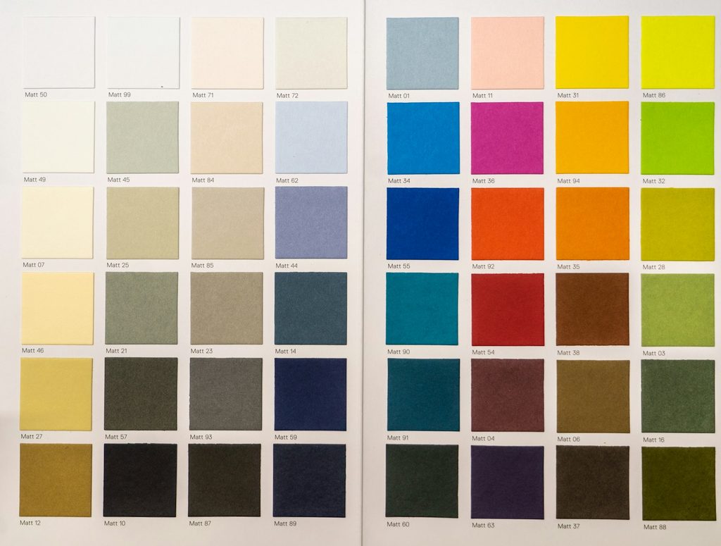
How do we build a good color palette?
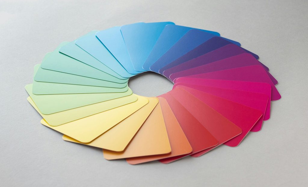
Well first, let’s start at the beginning. Color theory is the science of using colors. We all can mix and match colors to get different outcomes and effects based on the combination. There are different color combinations that are commonly used among designers. They are called color harmonies. Examples are primary, analogous, complementary, triad, and many more.
A basic understanding of color theory is important for your projects. It helps the end goal look polished and put together. Everyone interacts with color theory every day but most might not know the terminology or have a full understanding of how to utilize it.
Building your base
What emotion do you want to convey?
Something strong, calm, exciting, or balanced? Picking a base color gets the ball rolling and sets the tone for your color palette.

Depending on what your project is on, do you want to match similar existing styles or stand out with a unique twist? Find a brand that conveys the same mood you are looking for and notice what colors they chose. Once you’ve chosen a base color for your main elements, choosing 3 or 4 more to complement it is a good start.
A Quick Trick
Using Adobe Photoshop
If you are able to download and open Adobe Photoshop, there’s a cool trick you can use to build your color palette.
If you find an image somewhere, whether you took it yourself or found it on the internet, you can use it by pulling the colors from the image. First, open the image in Photoshop. Next, select the eye dropper tool. Click anywhere on the image and it will select the color of the pixel you clicked. See how Photoshop saved the color as your foreground color? Great! You’re on the right track.
Go to the left side panel and click the color you chose. There’s going to be a button you can select to “add the color to your swatches.” That means that later, you can go back and find this color again. This panel will also tell you the Hex code of the color and lots of other cool things. Continue this until you have a couple colors you would like to use in your palette.
Moving Forward
You might want to compare your color choices to the color harmonies I mentioned earlier. Do the few that you selected resemble one of them? When they sit side by side, do some of them stand out or contrast more? Moving forward in your art endeavors, I hope this trick gives you a new tool to fall back on and use when you’re looking for some inspiration.

If you want to learn more, there are color contrast checkers free online and free color palette generators available. My favorites are Colorkit and Adobe Express Color Palette Generator.
Get in touch
Follow me on Instagram